Dairy farmers in Washington state have been under significant pressure to reduce their carbon footprint in recent years. Dairy cooperative sustainability initiatives such as achieving carbon neutrality by 2050 have left many producers wondering what will be required of them to help their cooperatives meet this goal. Coupled with regulatory pressures to report on their greenhouse gas emissions and the threat of regulation to reduce them, uncertainty remains for producers around the types of climate-smart practices that will enable them to reduce their carbon footprint while remaining economically viable.
Without a thorough understanding of the costs and risks, pressures, or requirements to implement climate-smart practices may inadvertently drive consolidation and the accelerated loss of small to medium sized farms.
What Did We Do?
Utilizing Washington state dairy facility data, I conducted an economic cost benefit analysis of two climate-smart practices that capture GHGs from anaerobic storage: anaerobic digestors and the covered lagoon and flare system and the size of operation needed to implement both practices based on current and historic market conditions and technology costs. Private and public investment in climate-smart practices can have a substantial impact on whether they are economically feasible for producers to implement. I considered the impacts of various levels of cost-share on the size of farm able to adopt the technology based on several economic indicators.
What Have We Learned?
Most dairy farms cannot simply raise their prices to offset the costs of climate-smart practices, therefore it is critical to understand the broad economic impacts of imposing emissions reductions mandates. With consolidation being a well-documented trend across dairy farms in the United States, it is possible that climate regulations will only further exacerbate this trend due to the high capital costs and market risk associated with climate-smart farming that only facilities of scale can take on.
Future Plans
I am actively assisting research right now in Washington state with university and private researchers into dairy farm carbon intensities, across various farm sizes and facility types. An overview of this research may be available by Summer of 2025. Once this work is completed, we will have a better understanding of overall farm emissions and what climate-smart practices may be necessary for farms to implement to help achieve cooperative net zero targets.
Authors
Presenting & corresponding author
Nina Gibson, Agricultural Economist and Policy Specialist, Washington State Department of Agriculture, KGibson@agr.wa.gov
The authors are solely responsible for the content of these proceedings. The technical information does not necessarily reflect the official position of the sponsoring agencies or institutions represented by planning committee members, and inclusion and distribution herein does not constitute an endorsement of views expressed by the same. Printed materials included herein are not refereed publications. Citations should appear as follows. EXAMPLE: Authors. 2025. Title of presentation. Waste to Worth. Boise, ID. April 7–11, 2025. URL of this page. Accessed on: today’s date.
This webinar shares updates on approaches to precision agriculture for animal management, welfare and productivity, and how these applications influence nutrient management. This presentation was originally broadcast on May 17, 2024.Continue reading “Precision Ag In the Barn and In the Pasture”
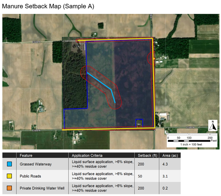
MyFarms, the software development team that manages the Manure Management Planner (MMP) desktop application, is now making it easy for TSPs to make beautiful manure setback maps that comply with government guidelines for use in Comprehensive Nutrient Management Plans (CNMPs). After using the MyFarms web-based platform to navigate a simple process (described below), the TSP will be able to download three digital assets from MyFarms including: 1.) The *.mmp project file, 2.) The PDF manure setback map book, and 3.) Manure setback images. TSPs will benefit from producing these downloads whether they use MMP or not and at any point in the planning process (i.e., before, during, or after entering data into MMP).
What Did We Do?
TSPs will begin by using MyFarms, a cloud-based field data management platform, to automatically fetch field boundaries from other cloud-based applications, such as Climate FieldView or the John Deere Operations Center. If the producer does not use one of those systems, the TSP can upload shapefiles, after exporting them from a different system. Or, if the producer has no field boundaries available, they can be created in MyFarms using existing field geometries.
After setting up field boundaries, the TSP will navigate a wizard-like process to create a “Feature Map” including wells, streams, water control structures, facilities, and roads. Then, the TSP can create a “Manure Setback Map” (below), by specifying the manure application practice(s) associated with each feature. As each selection is made, MyFarms dynamically calculates the setback area surrounding the feature so the user can easily see the relationship between the application practice, the setback distance, and the setback area.
After a setback map has been created for each field, the TSP can export the data they entered in MyFarms as an *.mmp project file, which can be used to create a new project in MMP. If the TSP has already used MMP to generate a CNMP in Word format, they can export setback map images and paste them into the Word document. Or, if the TSP does not use MMP at all, they can export the setback maps as a standalone document in PDF format.
What Will You Learn in this Workshop?
You will learn of what NRCS is doing to modernize the manure management planning process through state-of-the-art, cloud-based software. As a starting point, you will learn how to create professional looking manure setback maps more accurately and easily than ever before. Following the workshop, MyFarms will be available to register your own account, so you can take what you have learned into your next CNMP-focused client engagement.
Future Plans
The MMP Download(s) solution is the first of numerous steps that will be taken by Purdue University, NRCS, and MyFarms to modernize the manure management planning workflow. Over time, state-specific policies, logic, and reference data will be added to this foundation, to deliver a more pleasing end-to-end user experience.
Authors
Chris Fennig, Managing Director, MyFarms
Corresponding author email address
chris.fennig@myfarms.com
Additional Information
purduemmp.myfarms.com
Acknowledgements
This solution is being built in partnership with Purdue University and NRCS.
The authors are solely responsible for the content of these proceedings. The technical information does not necessarily reflect the official position of the sponsoring agencies or institutions represented by planning committee members, and inclusion and distribution herein does not constitute an endorsement of views expressed by the same. Printed materials included herein are not refereed publications. Citations should appear as follows. EXAMPLE: Authors. 2022. Title of presentation. Waste to Worth. Oregon, OH. April 18-22, 2022. URL of this page. Accessed on: today’s date.
To provide a forum for the introduction and evaluation of technologies that can treat dairy manure to the dairy farming community and the vendors that provide these technologies.
What Did We Do?
Newtrient has developed an on-line catalog of technologies that includes information on over 150 technologies and the companies that produce them as well as the Newtrient 9-Point scoring system and specific comments on each technology by the Newtrient Technology Advancement Team.
What Have We Learned?
Our interaction with both dairy farmers and technology vendors has taught us that there is a need for accurate information on the technologies that exist, where they are used, where are they effective and how they can help the modern dairy farm address serious issues in an economical and environmentally sustainable way.
Future Plans
Future plans include expansion of the catalog to include the impact of the technology types on key environmental areas and expansion to make the application of the technologies on-farm easier to conceptualize.
Corresponding author name, title, affiliation
Mark Stoermann & Newtrient Technology Advancement Team
All of the vendors and technology providers that have worked with us to make this effort a success need to be recognized for their sincere effort to help this to be a useful and informational resource.
The authors are solely responsible for the content of these proceedings. The technical information does not necessarily reflect the official position of the sponsoring agencies or institutions represented by planning committee members, and inclusion and distribution herein does not constitute an endorsement of views expressed by the same. Printed materials included herein are not refereed publications. Citations should appear as follows. EXAMPLE: Authors. 2017. Title of presentation. Waste to Worth: Spreading Science and Solutions. Cary, NC. April 18-21, 2017. URL of this page. Accessed on: today’s date.
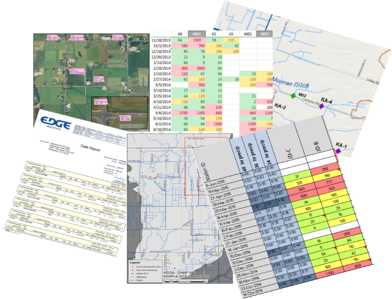
In 2015, Washington State Department of Agriculture (WSDA) partnered with local and state agencies to help identify potential sources of fecal coliform bacteria that were impacting shellfish beds in northwest Washington. WSDA and Pollution Identification and Correction (PIC) program partners began collecting ambient, as well as rain-driven, source identification water samples. Large watersheds with multiple sub-basins, changing weather and field conditions, and recent nutrient applications, meant new sites were added almost daily. The increased sampling created an avalanche of new data. With this data, we needed to figure out how to share it in a way that was timely, clear and could motivate change.
Conveying complex water quality results to a broad audience can be challenging. Previously, water quality data would be shared with the public and partners through spreadsheets or graphs via email, meetings or quarterly updates. However, the data that was being shared was often too late or too overwhelming to link locations, weather or field conditions to water quality. Even though plenty of data was available, it was difficult for it to have meaningful context to the general public.
Ease of access to results can help inform landowners of hot spots near their home, it can link recent weather and their own land management practices with water quality, as well as inform and influence decision-making.
What Did We Do?
Using basic GIS tools we created an interactive map, to share recent water quality results. The map is available on smartphones, tablets and personal computers, displaying near-real-time results from multiple agencies. Viewers can access the map 24 hours a day, 7 days a week.
We have noticed increased engagement from our dairy producers, with many checking the results map regularly for updates. The map is symbolized with graduated stop light symbology, with poor water quality shown in red and good in green. If they see a red dot or “hot spot” in their neighborhood they may stop us on the street, send an email, or call with ideas or observations of what they believe may have influenced water quality. It has opened the door to conversations and partnerships in identifying and correcting possible influences from their farm.
The map also contains historic results data for each site, which can show changes in water quality. It allows the viewer to evaluate if the results are the norm or an anomaly. “Are high results after a rainfall event or when my animals are on that pasture?”
The online map has also increased engagement with our Canadian neighbors to the north. By collecting samples at the US/Canadian border we have been able to map streams where elevated bacteria levels come across the border. This has created an opportunity to partner with our Canadian counterparts to continue to identify and correct sources.
What Have We Learned?
You do not need to be a GIS professional to create an app like this for your organization. Learning the system and fine-tuning the web application can take some time, but it is well worth the investment. GIS skills derived from this project have proven invaluable as the app transfers to other areas of non-point work. The web application has created great efficiencies in collaboration, allowing field staff to quickly evaluate water quality trends in order to spend their time where it is most needed. The application has also provided transparency to the public regarding our field work, demonstrating why we are sampling particular areas.
From producer surveys, we have learned that viewers prefer a one-stop portal for information. Viewers are less concerned about what agency collected the data as they are interested in what the data says. This includes recent, as well as historical water quality data, field observations; such as wildlife or livestock presence or other potential sources. Also, a brief weekly overview of conditions, observations and/or trends has been requested to provide additional context.
Future Plans
The ease and efficiency of the mobile mapping and data sharing has opened the door to other collaborative projects. Currently we are developing a “Nutrient Tracker” application that allows all PIC partners to easily update a map from the field. The map allows the user to log recent field applications of manure. Using polygons to draw the area on the field, staff can note the date nutrients were identified, type of application, proximity to surface water, if it was a low-, medium- or high-risk application, if follow-up is warranted, and what agency would be the lead contact. This is a helpful tool in learning how producers utilize nutrients, to refer properties of concern to the appropriate agency, and to evaluate recent water quality results against known applications.
Developing another outreach tool, WSDA is collecting 5 years of fall soil nitrate tests from all dairy fields in Washington State. The goal is to create a visual representation of soil data, to demonstrate to producers how nitrate levels on fields have changed from year to year, and to easily identify areas that need to be re-evaluated when making nutrient application decisions.
As part of a collaborative Pollution Identification and Correction (PIC) group, we would like to create a “Story Map” that details the current situation, why it is a concern, explain potential sources and what steps can be taken at an individual level to make a difference. A map that visually demonstrates where the watersheds are and how local neighborhoods really do connect to people 7 miles downstream. An interactive map that not only shows sampling locations, but allows the viewer to drill down deeper for more information about the focus areas, such as pop-ups that explain what fecal coliform bacteria are and what factors can increase bacteria levels. We envision a multi-layer map that includes 24-hour rainfall, river rise, and shellfish bed closures. This interactive map will also share success stories as well as on-going efforts.
Author
Kerri Love, Dairy Nutrient Inspector, Dairy Nutrient Management Program, Washington State Department of Agriculture
The web application was a collaborative project developed by Kyrre Flege, Washington State Department of Agriculture and Jessica Kirkpatrick, Washington State Department of Ecology.
The authors are solely responsible for the content of these proceedings. The technical information does not necessarily reflect the official position of the sponsoring agencies or institutions represented by planning committee members, and inclusion and distribution herein does not constitute an endorsement of views expressed by the same. Printed materials included herein are not refereed publications. Citations should appear as follows. EXAMPLE: Authors. 2017. Title of presentation. Waste to Worth: Spreading Science and Solutions. Cary, NC. April 18-21, 2017. URL of this page. Accessed on: today’s date.
Have you ever wondered whether manure should be treated on your livestock operation? What technology will work best in your situation? This webinar discusses strategies for selecting the right technology to meet your farm’s needs and reviews some proven and emerging technologies that are showing promise for the dairy industry. This presentation was originally broadcast on February 16, 2018. More…Continue reading “Making Sense of Treatment Technology Options for Livestock Farms”
Manage Cookie Consent
To provide the best experiences, we use technologies like cookies to store and/or access device information. Consenting to these technologies will allow us to process data such as browsing behavior or unique IDs on this site. Not consenting or withdrawing consent, may adversely affect certain features and functions.
Functional
Always active
The technical storage or access is strictly necessary for the legitimate purpose of enabling the use of a specific service explicitly requested by the subscriber or user, or for the sole purpose of carrying out the transmission of a communication over an electronic communications network.
Preferences
The technical storage or access is necessary for the legitimate purpose of storing preferences that are not requested by the subscriber or user.
Statistics
The technical storage or access that is used exclusively for statistical purposes.The technical storage or access that is used exclusively for anonymous statistical purposes. Without a subpoena, voluntary compliance on the part of your Internet Service Provider, or additional records from a third party, information stored or retrieved for this purpose alone cannot usually be used to identify you.
Marketing
The technical storage or access is required to create user profiles to send advertising, or to track the user on a website or across several websites for similar marketing purposes.

 ased engagement from our dairy producers, with many checking the results map regularly for updates. The map is symbolized with graduated stop light symbology, with poor water quality shown in red and good in green. If they see a red dot or “hot spot” in their neighborhood they may stop us on the street, send an email, or call with ideas or observations of what they believe may have influenced water quality. It has opened the door to conversations and partnerships in identifying and correcting possible influences from their farm.